外壁やエントランスなどのエクステリアデザインは、建物の印象を大きく左右する大切なポイントです。
そんな空間づくりに、植物の持つ自然な美しさと建築的なデザインを組み合わせてみると、かなり面白いビジュアルが作れます。
今回ご紹介するのは、Xで公開されていた、植物を使ったオシャレなエクステリアデザインを生成するプロンプトです。
今回のプロンプトでは、単純に壁へ植物を飾るのではありません。
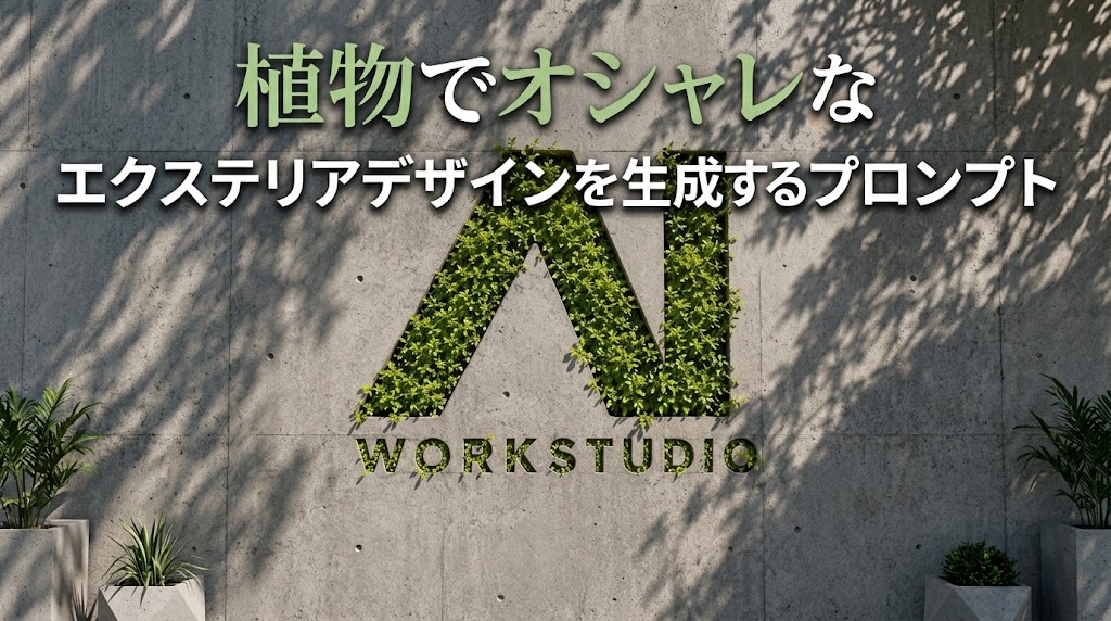
ロゴなどの認識しやすい形状をコンクリート壁の内部に浅く掘り込み、その凹みにたくさんの小さな植物を植え込んだような、建築物と植物が一体になったデザインを目指します。
遠くから見るとシンプルで洗練されたブランドデザインに見えながら、近づいて見ると、細かな葉っぱが一枚ずつ重なっていることが分かる――。
そんな「建築と植物が融合したような表現」を、画像生成AIで再現していくのが今回のポイントです。

植物と建築の組み合わせが面白いだも!
使うAIはChatGPT
今回このデザインを生成するために使うAIは、ChatGPT Images 2.0 です。
ChatGPT Images 2.0は、文章で作りたいビジュアルを伝えながら、画像を生成したり編集したりできる画像生成機能です。
今回のようなデザインでは、単に「植物のある壁」と指示するだけではなく、どの形を残すのか、植物をどこへ配置するのか、素材をどう見せるのか、光をどう当てるのかまで具体的に伝えることが重要になります。
ChatGPT Images 2.0は、こうした複数の条件を含んだプロンプトを使って、複雑なビジュアルを組み立てていく用途にも向いています。
特に今回のプロンプトは、「形状」「素材」「植物」「照明」「カメラ」「構図」といった要素が整理されているので、長い文章に見えても、役割ごとに分けて読むと意外と分かりやすくなっています。

長いけど分けて読むと楽しいなも!
プロンプトの紹介
ここからは、実際に使うプロンプトを見ていきましょう。
[ BRAND NAME = _____________ ]
[ MATERIAL COLOR = vivid acid chartreuse ]
Create a photorealistic architectural visualization using a recessed living-botanical concrete-inlay system.
CORE VISUAL SYSTEM
Transform the source into a permanent architectural installation cut directly into a large raw cast-concrete wall.
The defining idea is not a logo made from moss, not plants placed on top of a wall and not a conventional 3D extruded emblem.
The recognizable source geometry must exist as a shallow negative-space planter cavity physically recessed INTO the concrete surface and densely populated with hundreds of small living leaves.
The result should feel like a real outdoor architectural branding installation photographed in direct natural sunlight.
Combine three systems:
1. exact recognizable source geometry;
2. massive weathered cast-concrete architecture;
3. dense living botanical material growing from inside the recessed geometry.
SOURCE PRIORITY
If [SOURCE MODE = LOGO]:
Automatically identify the most recognizable authentic official standalone symbol of [BRAND NAME].
Preserve its canonical silhouette, proportions, curves, stroke relationships, intersections, counterforms, internal negative spaces and component spacing.
Do not redesign, simplify, stretch, round, reinterpret or generically approximate the identity.
Use the standalone symbol whenever one exists.
Do not automatically add a wordmark, registered symbol, trademark symbol or secondary branding unless it genuinely belongs to the supplied identity and is compositionally necessary.
Ignore the native logo colors. The botanical material follows [MATERIAL COLOR].
If [SOURCE MODE = ATTACHED IMAGE]:
Use the attached image as the sole source structure.
Preserve the dominant recognizable subject, silhouette, pose, proportions, orientation, major internal shapes and overall composition.
Translate the subject into the same recessed botanical architectural system rather than placing the original photograph onto the wall.
Maintain immediate recognition from normal viewing distance.
FORM AND CONSTRUCTION
Treat the concrete wall as one massive continuous architectural slab.
Cut the exact source silhouette inward into the concrete as a shallow planter cavity.
The recess should have believable physical depth, approximately 4–8% of the characteristic stroke width of the source geometry.
Do not extrude the logo outward.
Do not create a raised plaque.
Do not add a separate frame.
The concrete front face must remain completely flat around the source.
The cavity should have:
— clean vertical or subtly tapered internal concrete walls;
— realistic material thickness;
— extremely restrained edge rounding;
— tiny naturally worn concrete micro-bevels rather than decorative beveling;
— a dark recessed growing substrate visible only through occasional gaps between foliage;
— strong contact shadow inside the cavity.
Preserve all authentic negative spaces and counters as untouched concrete.
The source silhouette must remain geometrically disciplined even though the vegetation itself is organic.
BOTANICAL CONSTRUCTION
Fill the recessed source geometry with hundreds of individually distinguishable small living leaves.
Use compact ornamental creeping foliage similar in physical scale to miniature ivy, creeping fig, boxwood sprouts or dense architectural groundcover.
Avoid large tropical leaves.
Avoid grass.
Avoid fluffy moss.
Avoid uniform carpet-like vegetation.
Each plant cluster should contain multiple stems and leaves with subtle variation in:
— scale;
— orientation;
— curvature;
— overlap;
— height;
— rotation;
— density.
Maintain high foliage density so the source reads as a continuous botanical mass from a distance.
At close range the mass must resolve into many separate leaves rather than one procedural green texture.
Keep approximately 85–95% of the foliage inside the authentic source silhouette.
Allow a restrained 5–15% of leaves and stems to naturally protrude beyond selected edges, corners and openings.
This overgrowth must be asymmetrical and localized.
Do not destroy the source silhouette with uncontrolled vegetation.
Create slightly heavier botanical growth near a few structural junctions and lower edges while leaving occasional tiny dark gaps that reveal the recessed substrate beneath.
MATERIAL COLOR
The botanical material belongs to the [MATERIAL COLOR] family.
Do not apply [MATERIAL COLOR] as a flat uniform color.
Create natural tonal variation within that family:
— deeper and darker versions inside shadowed clusters;
— the primary [MATERIAL COLOR] across most foliage;
— slightly warmer or brighter sun-facing leaves;
— occasional pale edge highlights;
— minor saturation variation between individual leaves.
Even when [MATERIAL COLOR] is unconventional, the material must still behave physically like real thin living foliage rather than painted plastic.
CONCRETE MATERIAL
Use genuine architectural cast concrete.
Base tone: neutral-to-slightly-warm light grey.
Surface roughness approximately 0.75–0.9.
The concrete should be dry, mineral and almost completely diffuse.
Introduce restrained real-world imperfections:
— fine pores;
— shallow pinholes;
— microscopic mineral grain;
— faint patches;
— subtle discoloration;
— occasional abrasion;
— tiny chipped areas;
— extremely fine hairline marks;
— mild accumulated weathering;
— one or two broad construction or formwork seams.
Keep these details low contrast.
Do not turn the wall into distressed grunge.
The concrete should feel naturally aged and exposed to weather, not artificially textured.
LEAF SHADING
Each leaf should have believable thin-organic material response.
Use moderately matte waxy foliage:
— roughness approximately 0.35–0.55;
— restrained broad specular response;
— subtle translucency;
— slight light transmission through very thin sunlit edges;
— fine natural surface variation;
— no plastic gloss.
Sun-facing leaves may become noticeably brighter than shaded leaves.
Interior leaves should fall into deep green or [MATERIAL COLOR]-derived shadow tones.
LIGHTING
Use authentic exterior architectural daylight.
Primary illumination is one direct hard sunlight source positioned high above and to the camera-right/front side of the wall, striking the wall at an oblique angle.
The sunlight must produce clear directional shadows from every protruding leaf and stem.
These small botanical shadows are essential.
They should fall visibly across the surrounding concrete and reveal how far individual plants project from the recess.
Use a weak broad natural sky fill approximately 20–30% of the key intensity.
Maintain a high key-to-fill ratio around 4:1 to 6:1.
Do not flatten the shadows.
Do not use commercial studio softboxes.
Do not use rim-light setups.
Do not use neon lighting.
ENVIRONMENT SHADOWS
Introduce several large-scale irregular shadows from unseen vegetation, tree branches or architectural foliage outside the frame.
Let these broad organic shadows cross diagonally across the concrete surface.
They should be much larger than the source itself and partially overlap the composition.
Their edges may range from moderately crisp to slightly softened depending on distance from the wall.
These environmental shadows must feel accidental and naturally caused by direct sunlight, not designed as graphic overlays.
SHADOW DEPTH AND AMBIENT OCCLUSION
Use strong but physically believable contact shadows:
— deep shadow between densely overlapping leaves;
— restrained ambient occlusion where stems emerge from the substrate;
— a dark slit-like shadow at portions of the cavity boundary;
— increased occlusion in internal corners;
— individual cast shadows from leaves onto concrete.
The darkest values should exist primarily inside the recessed cavity and beneath dense foliage.
Do not outline the source with an artificial black stroke.
REFLECTIONS
The concrete must show virtually no readable mirror reflections.
Its response is broad and diffuse.
Leaves may produce small soft waxy specular highlights where sunlight strikes their curved surfaces.
No chrome reflections.
No HDRI streaks.
No artificial reflection cards.
No glowing highlights.
CAMERA
Photograph the wall almost perfectly front-on.
Keep the camera optical axis close to perpendicular to the concrete surface with only a very subtle natural architectural perspective.
Use the visual character of approximately a 45–60 mm full-frame lens.
Avoid wide-angle distortion.
Avoid exaggerated perspective convergence.
The source geometry should remain visually close to its canonical 2D proportions.
Camera height approximately aligned with the vertical center of the installation.
The wall itself should dominate the entire background and extend beyond every frame edge.
COMPOSITION
Square 1:1 frame.
Place the recognizable botanical source near the visual center with slight natural asymmetry if required by the authentic geometry.
Let it occupy approximately 55–65% of the frame width.
Preserve generous exposed concrete around it.
Do not crop important portions of the source.
Do not make the installation float.
It is physically carved into and supported by the wall.
The image should feel like a large permanent outdoor installation photographed in situ rather than a small decorative object photographed in a studio.
DEPTH OF FIELD
Use deep architectural depth of field.
Equivalent to approximately f/8–f/11.
Keep:
— the concrete surface;
— recess edges;
— the majority of the leaves;
— environmental texture
clearly resolved.
Only extremely small depth variation between the nearest and deepest leaves may soften subtly.
No macro bokeh.
No shallow advertising-style DOF.
RENDER CHARACTER
Photorealistic architectural photography with physically plausible path-traced material behavior.
Natural dynamic range.
Strong direct sunlight but preserved highlight detail.
Dense physically grounded contact shadows.
Fine concrete microtexture.
Individually resolved foliage.
Subtle optical imperfection rather than sterile CGI perfection.
The final image should initially read as a clean recognizable identity and only on closer inspection reveal the complex living botanical construction.
NEGATIVE CONSTRAINTS
Do not create a normal 3D extruded logo.
Do not place a green logo on top of concrete.
Do not use a separate planter box.
Do not create a framed green wall.
Do not use fluffy moss.
Do not use grass.
Do not use artificial turf.
Do not use large jungle plants.
Do not cover the entire wall with vegetation.
Do not lose authentic source geometry.
Do not fill authentic internal negative spaces.
Do not create excessive uncontrolled overgrowth.
Do not use perfectly repeated procedural leaves.
Do not make the vegetation look like plastic.
Do not use flat green texture fills.
Do not add decorative outlines.
Do not create thick rounded logo bevels.
Do not use glossy concrete.
Do not add neon glow, bloom, fog, dramatic volumetric light or artificial cinematic effects.
Do not create a studio backdrop.
The visual strength must come from precise geometry, raw mineral concrete, living botanical complexity, direct sunlight and physically convincing cast shadows.
今回のプロンプトはかなり長めですが、難しく考えなくても大丈夫です。大きく分けると、ブランドの形を決める部分、植物の表現、コンクリートの質感、光と影、カメラや構図を順番に指定しています。

役割ごとに見ると分かりやすいだも✨
形をしっかり残すのがポイント

まず重要なのが、元になる形状を正確に残すことです。
ブランドロゴを使う場合は、単純に「植物でロゴを作る」のではありません。ロゴ本来のシルエットや比率、曲線、内部の空間まで維持したうえで、それをコンクリート壁の中へ浅く掘り込んだ植栽スペースとして表現します。
ここが今回のデザインで特に面白いところです。
植物がロゴの形を作っているように見えますが、実際にはロゴそのものを立体化しているわけではありません。壁をくり抜いた空間の中に植物が生えているという構造になっています。
そのため、ロゴを外側へ突き出したような立体エンブレムではなく、建築物に直接組み込まれた恒久的なインスタレーションらしい雰囲気が生まれます。
また、ロゴ内部にある本来の余白は植物で埋めず、コンクリートとして残すように指定されています。これによって、植物が増えても元のロゴとして認識しやすい状態を保ちやすくなっています。

形を崩さないのが大事なもね!
植物をぎゅっと自然に見せる
次にこだわっているのが、植え込まれる植物の表現です。
ここでは、何百枚もの小さな葉が密集しているような植物を使います。イメージとしては、ミニチュアのアイビーやクリーピングフィグ、低木のような細かな葉を持つ植物です。
反対に、大きな南国系の葉っぱや芝生、ふわふわした苔などは使わないように指定されています。
さらに、葉っぱをすべて同じ大きさ・同じ向きにするのではなく、大きさ、向き、曲がり方、重なり、高さ、密度などに少しずつ違いをつけます。
こうすることで、植物が単なる緑色のテクスチャではなく、「本当に一枚ずつ葉っぱが生えている」ように見えやすくなります。
また、植物の大部分はロゴの形状の内側に収めながら、一部だけが外側へ自然に伸びるようにするのもポイントです。
この少しだけ制御されたはみ出しが、人工的に整えすぎた植栽ではなく、時間をかけて植物が成長したような雰囲気につながります。

葉っぱの違いまで自然にするだも!
コンクリートにもリアルな表情を
植物だけリアルにしても、壁がきれいすぎるとCGっぽさが出てしまいます。
そこでプロンプトでは、コンクリートについてもかなり細かく指定しています。
ベースとなるのは、少し暖かみのあるライトグレーの打ち放しコンクリートです。
そこへ細かな気泡、ピンホール、鉱物の粒、薄い変色、擦れ、小さな欠けなどを加えます。
ただし、ここで重要なのは「汚すこと」が目的ではないという点です。
古びた建物のように過度なグランジ加工をするのではなく、屋外に長く設置されている建築物として、自然な経年変化が感じられる程度に抑えています。
植物の鮮やかさと、少し無機質なコンクリート。この異なる素材のコントラストが、デザイン全体を引き締めてくれます。

無機質な壁との対比が映えるなも!
光と影で立体感を引き出す
そして、このデザインをリアルに見せるうえで欠かせないのが光と影です。
プロンプトでは、屋外の強い自然光が斜めから壁に当たるように設定しています。
すると、植物の葉や茎が壁へ細かな影を落とします。
この影があることで、植物が単なる平面的な模様ではなく、「壁の奥から実際に生えている」ような奥行きを感じられるようになります。
さらに、画面外にある木々や植物などによって生まれた大きな影も、コンクリート壁へ自然に落とします。
細かな葉っぱの影と、大きな環境の影。この2種類を組み合わせることで、屋外の建築写真らしいリアリティを作っています。

影があると一気に本物っぽいだも!
正面から撮った建築写真にする
最後に、カメラと構図にも注目してみましょう。
今回は、壁をほぼ真正面から撮影するような構図です。
広角レンズによる大きな歪みを避け、ロゴの形が本来の比率に近い状態で見えるようにしています。
画面は正方形の1:1。植物で作られたシンボルを中央付近に配置し、周囲にはコンクリートの余白を残します。
この余白があることで、植物部分だけが妙に浮いて見えることなく、「大きな建築壁の一部」として自然に馴染みます。
また、被写界深度は深めに設定し、コンクリートの表面から植物、凹みの奥までしっかり見えるようにしています。
そのため、近距離の植物だけをぼかすような広告写真ではなく、建築物そのものを記録したような写真に仕上げることを狙っています。


建築写真っぽく見せるのがコツなも✨
まとめ
今回のプロンプトは、植物をただ飾るのではなく、ブランドの形状と建築、そして生きた植物をひとつのデザインとして融合させるのが大きな特徴です。
コンクリートの質感、葉っぱの細かな違い、自然光による影、正面から見た構図まで細かく指定することで、CGらしい作り物感を抑え、実際に存在する屋外インスタレーションのような表現を狙っています。
使うブランド名や元画像を変えれば、さまざまなシンボルやモチーフへ応用できるのも面白いところです。
エクステリアや店舗デザインのアイデアを考えたいときはもちろん、ブランドの世界観をビジュアル化したいときにも活用できそうですね。
植物と建築を組み合わせるだけで、普段とは少し違った「自然とデザインが共存する空間」をAIで考えられます。気になった方は、ぜひChatGPT Images 2.0で試してみてください。

自分だけの壁面デザインも楽しそうだも!
合わせて読みたい
こちらの記事では、フレッシュなスプラッシュ系ジュース広告風ポスターを生成できるプロンプトを紹介しています。