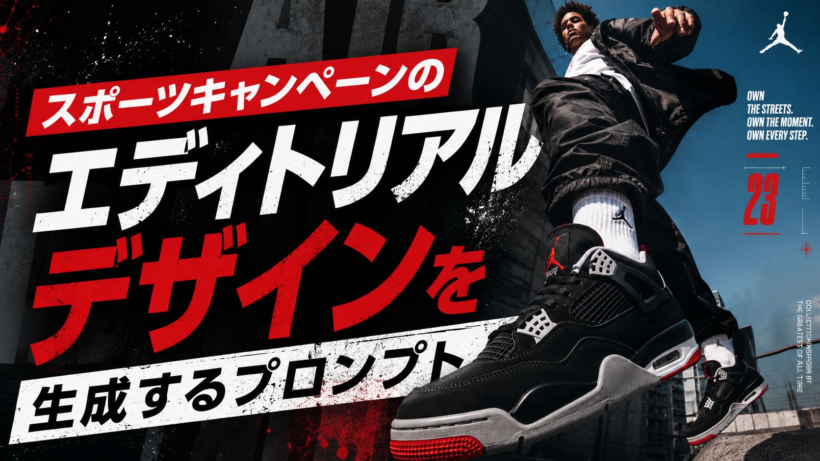
スポーツブランドの広告やSNSで、躍動感のある選手写真に、大きな文字やグラフィックが組み合わさったビジュアルを見かけることがありますよね。
ただ商品をきれいに撮影するだけではなく、「写真」「タイポグラフィ」「グラフィック」を一体化させたデザインです。
今回紹介するのは、そんな本格的なスポーツキャンペーン風のエディトリアルデザインを生成するためのプロンプトです。
今回のプロンプトで面白いのは、単純なスポーツ写真を作ることが目的ではないところです。
大きな特徴は、写真をデザインの土台として扱うこと。
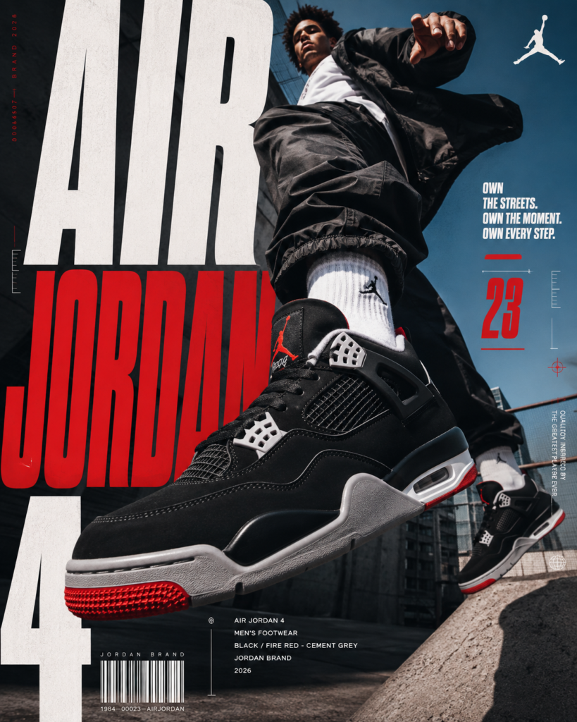
選手の動きやスニーカーの存在感を中心にしながら、その上に大きな見出しや細かな情報、バーコードのようなグラフィック要素などを組み合わせます。
特に重要なのが、文字を画像の上に「後から載せた」ように見せないことです。
選手の身体やスニーカーの前後関係に合わせて文字を配置し、一部を隠したり、逆に被せたりすることで、写真と文字が同じ空間に存在しているような奥行きを作ります。
こうした設計によって、一般的な商品画像とは違った、広告キャンペーンらしい仕上がりを狙えるわけです。

スポーツ広告みたいで迫力満点なも!
今回使うのはChatGPT
今回、このプロンプトを試すAIとして使うのが ChatGPT Images 2.0 です。
ChatGPT Images 2.0は、OpenAIが2026年4月に発表した画像生成モデルです。画像の生成だけでなく、既存画像の編集にも対応しています。
また、画像の中に文字や細かなディテールを含めた画像を生成できることも特徴のひとつです。
ポスターやエディトリアル風のビジュアル、複雑なテキストを含む画像など、写真とタイポグラフィを組み合わせたデザインとは相性のよい機能といえるでしょう。
難しい画像編集ソフトを最初から使わなくても、自然な言葉で「こんな広告ビジュアルを作りたい」と伝えながら試せるのが魅力です。

広告デザインにも使いやすそうだも!
プロンプトで本格的な広告を作ろう
JORDAN BRAND — EDITORIAL SPORTS SMM CAMPAIGN Act as a Senior Sportswear Art Director, Editorial Poster Designer, Advertising Creative Director, Commercial Photographer, and Visual Communication Designer creating a premium 4:5 social-media campaign creative for JORDAN BRAND. The visual direction must follow the high-energy sports editorial language of premium Jordan / basketball advertising: dynamic athlete photography, extreme perspective, oversized condensed typography, bold color blocking, product-focused composition, technical graphic details, and aggressive editorial information hierarchy. The final creative must feel like a professionally art-directed campaign poster created by a global sportswear agency and strong enough to be featured on Behance. This is NOT a clean minimalist sneaker advertisement. This is NOT a traditional magazine cover. This is NOT a generic Instagram template. This is NOT a product catalogue. The photograph is the canvas. The typography is part of the photograph. The graphics complete the campaign. PHASE 0 — BRAND INTELLIGENCE Brand: JORDAN BRAND Build the visual system around Jordan’s recognizable brand codes: JORDAN JUMPMAN 23 AIR FLIGHT BASKETBALL PERFORMANCE STREETWEAR MOVEMENT CULTURE Visual character: bold, athletic, confident, urban, competitive, fashion-conscious, graphic, high-energy, and contemporary. Typography character: bold condensed grotesque, tall vertical proportions, heavy visual weight, tight spacing, strong geometric construction, sharp athletic presence, high-impact display scale. The typography should feel like modern sports editorial typography rather than a generic sports font. Primary palette: BLACK WHITE JORDAN RED Allow the sneaker’s authentic colorway to introduce additional controlled color only when necessary. PHASE 1 — CREATIVE CONCEPT Create a high-energy editorial campaign around: [AIR JORDAN MODEL] Example: AIR JORDAN 4 Core concept: [CONCEPT] The concept should communicate the personality of the sneaker through movement, perspective, typography, and visual storytelling. Treat the sneaker as the central cultural object. The visual should communicate: SPEED MOVEMENT ATTITUDE STREET CULTURE PERFORMANCE without becoming visually chaotic. The viewer should understand the product immediately. PHASE 2 — HERO SUBJECT Use a realistic fictional young adult athlete wearing the specified Jordan sneaker. Do not depict or reference a named real athlete or celebrity. The athlete should have a believable contemporary street-basketball aesthetic. Wardrobe: oversized contemporary streetwear, technical basketball-inspired clothing, relaxed trousers or shorts, layered garments, subtle Jordan styling, authentic urban fashion. The Jordan sneaker must remain the primary product focus. Product accuracy is critical: exact silhouette, correct proportions, correct outsole, correct panel construction, correct stitching, correct laces, correct tongue, correct heel, correct Jumpman placement, correct AIR branding, correct colorway, accurate materials, accurate sole construction. Do not redesign or hybridize the sneaker. PHASE 3 — PHOTOGRAPHIC CONCEPT Create an extreme low-angle action photograph. Camera positioned very low near ground level. The athlete is captured during dynamic movement. One Jordan sneaker is dramatically closer to the camera, creating exaggerated but physically believable scale. The foreground sneaker dominates the composition. The athlete’s body rises through the frame. The second sneaker and body create a strong vertical movement. Use a perspective similar to premium basketball advertising photography. The image should feel captured at the decisive moment of movement rather than posed. Possible action: jumping, stepping onto a ledge, running toward camera, landing, walking aggressively through an urban environment, or performing a controlled basketball movement. Choose ONE action. Do not create an impossible pose. PHASE 4 — COMPOSITION Format: 4:5 vertical. Use the entire photograph as the visual foundation. NO SPLIT SCREEN. NO SEPARATE DESIGN PANELS. NO CARD LAYOUT. Create a strong diagonal and vertical composition. Hero sneaker: foreground, large, extremely detailed, slightly exaggerated through perspective. Athlete: slightly behind the sneaker, extending toward the upper portion of the frame. Create strong negative space around the upper and side areas for typography. Use intentional cropping. Allow: feet, legs, clothing, headline, and graphic elements to extend beyond conventional boundaries. The composition should feel energetic even when viewed as a still image. PHASE 5 — TYPOGRAPHIC SYSTEM Primary headline: AIR JORDAN 4 Use oversized condensed typography. Break the headline across multiple lines. Example hierarchy: AIR JORDAN 4 The largest line should occupy a substantial portion of the composition. Typography should interact directly with the athlete and sneaker. Some letters may pass behind the subject. Other letters may appear over the subject. The sneaker may partially obscure the typography. Create genuine depth between: foreground sneaker, athlete, typography, and background. Do NOT simply place text on top of the image. Typography must feel physically integrated into the photographic composition. Primary typography: JORDAN RED Secondary typography: WHITE Use BLACK where necessary for contrast. No: drop shadows, glows, bevels, 3D extrusion, chrome effects, random gradients, decorative fonts. PHASE 6 — SUPPORTING COPY Add restrained editorial copy. Example: OWN THE STREETS. OWN THE MOMENT. OWN EVERY STEP. Use short lines only. Supporting typography should be significantly smaller than the primary product title. Place it inside negative space without competing with the sneaker. Use clean italic or regular supporting typography to create contrast against the heavy headline. Do not overload the design with copy. PHASE 7 — PRODUCT INFORMATION Create a small editorial information system. Example: AIR JORDAN 4 MEN’S FOOTWEAR JORDAN BRAND 2026 or accurate product-specific information where applicable. Add: MODEL CATEGORY COLORWAY YEAR Use small tracked typography. The information should feel like authentic campaign metadata. Do not invent technical specifications. Do not invent product claims. PHASE 8 — GRAPHIC DETAILS Introduce restrained sports-editorial graphics. Use: barcode, 23, small technical numbers, thin horizontal rules, measurement marks, small registration details, micro labels, geometric markers, subtle court-line geometry, or campaign indexing. The barcode should function as a graphic element rather than fake scannable information. Use the number: 23 as a recognizable Jordan visual code. Do not scatter graphics randomly. Every graphic element must support the composition. PHASE 9 — BRAND SIGNATURE Place the authentic Jordan / Jumpman identity discreetly. Preferred location: upper corner or lower corner. Use the Jumpman as a clean independent brand signature. Do not distort the logo. Do not redraw the logo. Do not duplicate it excessively. Maintain strong breathing space around the mark. PHASE 10 — ENVIRONMENT Create a contemporary urban basketball environment. Possible environment: rooftop basketball court, urban concrete architecture, city staircase, industrial basketball court, brick building, street court, concrete ledge, or contemporary urban sports environment. The environment should feel authentic and editorial. Use architectural lines to reinforce the movement of the composition. Avoid cliché basketball props. Do not fill the scene with basketballs, hoops, graffiti, or unnecessary objects. The sneaker and athlete remain the heroes. PHASE 11 — COLOR & BACKGROUND Use a strong Jordan-inspired campaign palette. Dominant background: clean atmospheric blue or neutral environmental tone depending on the photographic concept. Typography: WHITE + JORDAN RED. Product: preserve exact sneaker colorway. Use strong contrast between the athlete, sneaker, typography, and environment. The color treatment should feel like premium sports advertising rather than a generic AI color grade. Maintain natural skin tones. Maintain realistic product colors. PHASE 12 — LIGHTING Use dramatic natural daylight. Bright directional sunlight. Strong but physically believable shadows. Clear highlights on the sneaker. Controlled rim separation around the athlete. Subtle atmospheric depth. The sneaker must have realistic: surface reflections, rubber texture, leather texture, mesh texture, stitching, and outsole detail. Avoid: HDR, excessive bloom, fake lens flare, plastic materials, overprocessed skin, oversharpening, unrealistic shadows. PHASE 13 — CAMERA Professional commercial sports photography. High-resolution full-frame or medium-format photographic character. Low-angle camera position. Approximately 24–35mm equivalent lens for dramatic perspective while maintaining realistic proportions. Fast shutter speed. Sharp action capture. Deep enough focus to preserve the foreground sneaker and athlete. Natural optical rendering. The foreground sneaker should be extremely detailed. Perspective must remain physically believable despite the dramatic scale. PHASE 14 — EDITORIAL GRAPHIC HIERARCHY Visual hierarchy: 1. FOREGROUND JORDAN SNEAKER 2. AIR / JORDAN 4 TYPOGRAPHY 3. ATHLETE 4. SUPPORTING COPY 5. 23 / GRAPHIC SYSTEM 6. PRODUCT INFORMATION 7. JUMPMAN The eye should move: SNEAKER → HEADLINE → ATHLETE → GRAPHIC DETAILS → BRAND SIGNATURE The composition must have immediate impact at thumbnail size. PHASE 15 — SOCIAL MEDIA OPTIMIZATION Format: 4:5 vertical. Designed specifically for Instagram. The primary sneaker must remain recognizable at thumbnail size. The headline must remain readable. The red / white / black hierarchy must remain visually strong. Keep critical typography inside safe margins. Allow secondary details to become visible only at full-screen viewing. The creative should look native to social media while retaining premium campaign quality. PHASE 16 — BEHANCE-FEATURED QUALITY The final artwork should feel like: JORDAN BRAND + SPORTS PHOTOGRAPHY + EDITORIAL TYPOGRAPHY + STREETWEAR + ADVERTISING ART DIRECTION + CONTEMPORARY GRAPHIC DESIGN. The result should resemble a premium campaign poster designed by a multidisciplinary creative agency. Not a Canva template. Not an AI sneaker poster. Not a generic sports graphic. Not a catalogue image. Not a simple product photograph. Every element must feel intentionally art-directed. PHASE 17 — QUALITY CONTROL Verify: accurate Jordan sneaker silhouette, accurate sneaker colorway, correct Jumpman, correct AIR branding, correct proportions, realistic footwear construction, realistic stitching, realistic outsole, realistic materials, realistic athlete anatomy, physically believable action, correct perspective, consistent shadows, natural lighting, clean typography, correct spelling, correct numbers, clear AIR / JORDAN 4 hierarchy, professional graphic alignment, no malformed text, no random letters, no fake logos, no duplicated objects, no floating objects, no distorted sneaker, no unnecessary props, no generic AI artifacts. FINAL OUTPUT 4:5 vertical. Single full-frame editorial sports composition. Dynamic low-angle action photography. Oversized condensed typography integrated into the photograph. Jordan Red + White + Black graphic hierarchy. Prominent Jordan sneaker. Fictional athlete. Urban basketball environment. Technical editorial details. Barcode graphic. 23 visual code. Jumpman brand signature. Premium commercial photography. Behance-featured art direction. The final image should feel like an authentic high-energy Jordan Brand social campaign where the sneaker, athlete, typography, photography, and graphic system become ONE visual composition. Make it bold. Make it athletic. Make it editorial. Make it culturally relevant. Make the sneaker impossible to ignore.
ここからは、今回のメインとなるプロンプトを紹介していきます。
このプロンプトでは、単に「スポーツブランド風の画像」と指示するのではなく、アートディレクターや商業カメラマン、エディトリアルデザイナーなど、複数の視点をまとめて指定しています。
さらに、画像の構図やカメラ、光、色、文字組み、商品情報、グラフィック要素まで細かく指定しているのが特徴です。
そのため、画像生成AIに「どんな雰囲気にしたいか」だけでなく、「画面の中で何をどう見せたいか」まで伝えやすくなっています。

細かく指示すると狙いやすいなも✨
まずは商品を主役にする
プロンプトの中心にあるのが、スニーカーを主役として見せる考え方です。
前景にスニーカーを大きく配置し、低い位置から撮影することで、実際のサイズ以上に迫力を感じるようなパースを作ります。
一方で、選手はスニーカーの後ろから上方向へ伸びるように配置。スニーカーと選手の動きによって、画面に縦方向の勢いを生み出します。
ここで大切なのは、単純に商品を大きくすることではありません。あくまで「現実に撮影できそうな範囲」を意識しながら、広角レンズらしい遠近感を利用することです。
これによって、AI画像にありがちな不自然な巨大化ではなく、商業スポーツ写真のような迫力を狙います。

スニーカーを最優先で見せるだも!
ローアングルで躍動感を出す
写真表現では、カメラを地面近くまで下げたローアングルを指定しています。
さらに、選手がジャンプしたり、走ったり、ステップしたりする瞬間を捉えることで、止まった商品写真ではなく、動きの途中を切り取ったようなビジュアルを目指します。
プロンプトでは、複数のアクション候補を示したうえで、ひとつの動作だけを選ぶように指示しています。
これは、動きを盛り込みすぎて不自然なポーズになるのを避けるためです。
また、24〜35mm相当の広角寄りのレンズを想定しているため、手前のスニーカーを大きく見せながら、選手の身体も画面の中に残しやすくなっています。

低い目線が迫力の秘密なもね!
大きな文字を写真に溶け込ませる
今回のデザインで、もうひとつ重要なのがタイポグラフィです。
メインとなる「AIR JORDAN 4」を大きく配置し、複数行に分けながら画面のかなり広い範囲を使います。
ここでも、単純に文字を画像へ重ねるだけではありません。
文字の一部を選手の後ろへ回したり、スニーカーに隠したり、逆に身体の上へ重ねたりすることで、前景・人物・文字の奥行きを作ります。
文字が写真の外側にある「説明」ではなく、写真の中に存在する「オブジェクト」のように見せるわけです。
また、太く縦長のコンデンス系書体を想定し、赤・白・黒を中心とした強いコントラストを作ることで、スポーツ広告らしい視認性も意識しています。

文字も主役級に大きくするだも✨
細かなグラフィックで広告感をプラス
大きな写真と見出しだけではなく、細かなグラフィックも加えます。
プロンプトでは、バーコードや「23」、細い罫線、計測マーク、番号、マイクロラベルなどが例として指定されています。
こうした要素を画面全体へ無造作に散らすのではなく、あくまで構図を補助するための情報として配置するのがポイントです。
商品名やカテゴリー、カラーウェイ、年などの小さな情報を加えることで、実際のキャンペーン広告にありそうな情報設計へ近づけていきます。
ただし、プロンプトでも技術仕様や商品に関する情報を勝手に作らないよう指定されています。広告らしさを出すために情報を増やしすぎないことも重要です。

細部が広告っぽさを作るなも!
SNS広告として仕上げる
完成する画像は4:5の縦長フォーマットを基本としています。
Instagramのフィードなどで使いやすい縦型の比率を前提に、サムネイルサイズでもスニーカーとメイン見出しが認識できるように設計します。
一方で、画面を情報で埋め尽くすのではなく、上部や左右には文字を配置できる余白を残します。
重要な情報は安全な範囲に収めつつ、細かなグラフィックはフルスクリーンで見たときに気づくくらいの密度に抑える設計です。
このように、一覧で見たときのインパクトと、拡大して見たときの細かな情報量を両立させることで、SNS向けでありながら、作品としても見応えのあるビジュアルを目指します。

SNSでも映えるデザインだもね!
プロンプトを使うときのポイント
今回のプロンプトには、商品名を固定する部分と、自由に変更できる部分があります。
たとえば[AIR JORDAN MODEL]には作りたいモデルを、[CONCEPT]にはビジュアル全体のテーマを入れられます。
そのため、同じ構成を使いながら、商品やコンセプトを変えて何パターンも試すことができます。
また、実在するアスリートや著名人を指定するのではなく、架空の若い成人アスリートを使う構成になっています。
商品を主役にしながら人物の存在感も加えることで、特定の人物に依存しないキャンペーンビジュアルを作りやすくしています。

商品やテーマを変えて遊べるなも!
まとめ
今回のプロンプトは、スポーツ写真だけでなく、写真・文字・グラフィックを一体化した広告デザインを狙えるように細かく設計されています。
ローアングルのアクション写真を中心に、大きなタイポグラフィや赤・白・黒を基調としたグラフィック、細かなキャンペーン情報などを組み合わせることで、SNSでも目を引くビジュアルを目指します。
特に、スニーカーを画面の主役にしながら、文字を写真の一部として扱う考え方が大きなポイントです。
ChatGPT Images 2.0でスポーツ広告のような画像を作ってみたい方は、今回のプロンプトをベースに、モデル名やコンセプトを変えながら試してみてはいかがでしょうか。

まずは好きな商品で試してみるだも!
合わせて読みたい
こちらの記事では、写真をミニマリストな白黒落書きイラストに変換できるプロンプトを紹介しています。