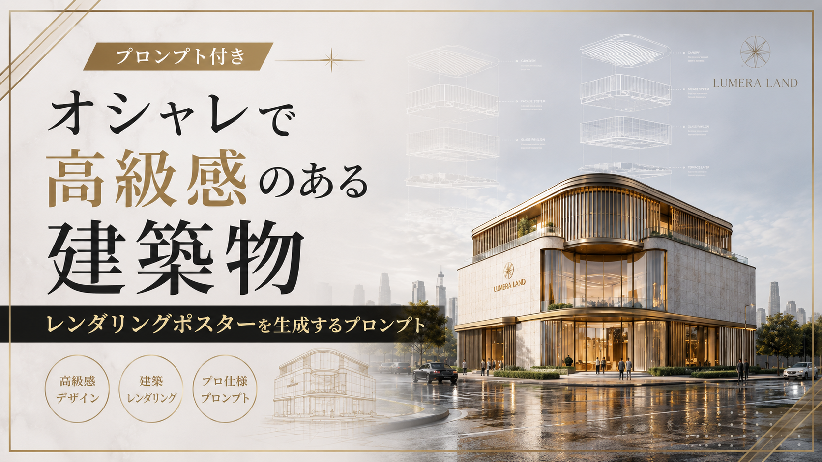
AIで画像を作っていると、ただ建物をリアルに描くだけではなく、「高級ブランドの広告作品のような一枚」を作ってみたくなることがあります。
今回ご紹介するのは、そんな用途にぴったりなオシャレで高級感のある建築物レンダリングポスターを生成するプロンプトです。建築物そのものを主役にしながら、広々とした空、繊細な建築図面、上質なタイポグラフィまで組み合わせ、まるで海外の高級不動産ブランドが手がけたようなビジュアルを目指します。
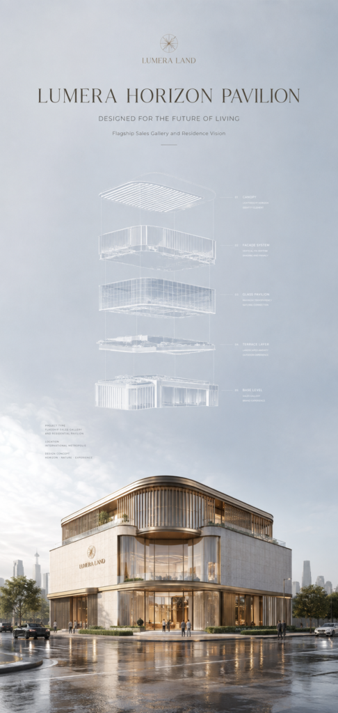
画面の上部にはたっぷりとした空間を取り、その中に建築のエクスプローデッド・ダイアグラムを浮かべます。建物をいくつかの層に分解して見せることで、完成した建築だけでは伝わりにくい設計思想まで感じられる構成です。
そして下側には、淡い石材やシャンパンカラーの金属、透明感のあるガラスなどを使った、ラグジュアリーな建築物を配置します。濡れた路面に柔らかく反射する光や、建物内部から漏れる暖かな明かりも加えることで、落ち着きのある高級感を演出します。
さらに、ブランド名やプロジェクト名、キャッチコピーなどを英語で控えめに配置。情報を詰め込むのではなく、「余白そのものをデザインとして使う」ことが、このプロンプトの大きなポイントです。

余白が高級感を作るだもね!
今回使うAIはChatGPT
今回の画像生成には ChatGPT Images 2.0 を使います。
ChatGPT Images 2.0は、OpenAIが2026年4月に発表した画像生成モデルです。公式発表では、従来よりも指示への追従性や細かなディテールの生成、複雑な文字を含む画像の生成能力などが強化されたと説明されています。
今回のようなポスターでは、建物の形だけでなく、文字の配置や画面全体の構成まで指定したくなります。そのため、細かな条件をまとめて伝えられるChatGPT Images 2.0とは相性のよいテーマといえそうです。
また、ChatGPT Images 2.0では、新しい画像を作るだけでなく、既存画像をアップロードして変更を指示することもできます。テキストを追加したり、画像内の細部を変更したりする指示にも対応しています。
そのため、最初から完璧なポスターを一発で作ろうとするより、まず全体の構成を生成し、気になる部分を少しずつ調整していく使い方もおすすめです。

細かく直せるのも便利なもね!
プロンプトの紹介
Create an ultra-premium real estate architectural sales poster for a self-created international luxury property developer, combining the clean authority of an elite architectural presentation board with the emotional refinement of a world-class luxury residence campaign. The composition must preserve a strong vertical hierarchy with vast atmospheric negative space, a floating exploded architectural line diagram in the upper sky, and a hyper-real built landmark anchored below. The final image must feel calmer, more collectible, more spacious, and more luxurious, with the architecture remaining the absolute visual hero.
Brand identity:
Use a self-created international luxury real estate brand:
LUMERA LAND
Project name:
LUMERA HORIZON PAVILION
Main headline:
DESIGNED FOR THE FUTURE OF LIVING
Supporting line:
Flagship Sales Gallery and Residence Vision
All typography must be elegant English only, highly restrained, beautifully spaced, and integrated like a premium architectural identity system. No Chinese headline. No crude bold fonts. No noisy brochure styling.
Core composition:
Use a tall vertical poster with an extremely disciplined top-heavy structure.
The upper two-thirds of the image must be dominated by a vast sky field with expanded negative space, creating a strong sense of calm, rarity, and architectural confidence.
Use a soft pale silver-blue, misty pearl, and cool warm-gray atmospheric gradient, cleaner and more luminous than before.
At the upper center, place a floating exploded architectural diagram rendered in ultra-thin white linework, with several separated building layers suspended in precise vertical alignment.
The line drawing must feel lighter, finer, more elegant, and more technically beautiful, with increased spacing between layers and more air around the diagram.
At the top center, integrate the brand and headline in a refined premium layout with strong breathing room.
The lower third must reveal the completed architecture in hyper-real cinematic form, monumental yet calm, grounded in a pristine urban frontage.
Architectural subject:
Design a flagship luxury sales pavilion and branded residential showcase building for a premium real estate developer.
The building must feel internationally high-end, buildable, iconic, and highly desirable.
Use a sculptural contemporary form with softened corners, disciplined massing, elegant vertical facade fins, pale mineral stone, champagne-toned metal detailing, ultra-clear glass, and warm interior architectural glow.
The building should feel more residential-luxury and hospitality-grade, less commercial and less generic.
Its silhouette must remain simple, confident, and memorable.
Transit + Orbit enhancement:
Push the image toward a more spacious collector-grade presentation.
Increase the clean sky area and reduce visual noise even further.
Make the exploded line diagram more delicate, more sparse, and more precise, with thinner drafting lines, cleaner layer separation, and subtler construction guides.
At the same time, shift the material language of the real building into a warmer, more refined luxury palette: pale stone, soft champagne metal, warm timber undertones, and crystal-clear glazing.
The result must feel like a top-tier global luxury real estate launch image, where technical design intelligence and emotional premium atmosphere are perfectly balanced.
Design representation:
The floating exploded architectural diagram must clearly correspond to the building below.
Show multiple horizontal layers separated elegantly in space, as if the project is being revealed through a refined architectural thinking process.
The linework must be extremely accurate, graceful, and minimal.
Include only subtle technical trace lines, tiny specification accents, and refined drafting logic.
The diagram should feel almost weightless in the sky, like a museum-grade architectural sketch.
Environment:
Place the built architecture in a pristine urban frontage with a broad open street and a lightly reflective ground plane.
The environment should feel freshly washed, calm, and expensive, with very controlled reflections and minimal clutter.
Include only a few understated pedestrians and a small number of refined vehicles for scale.
Add very limited edge landscaping or distant urban context, keeping the building visually dominant.
Everything must feel clean, organized, and premium.
Lighting:
Use extremely soft post-rain morning light or refined bright overcast luxury daylight.
The sky must feel luminous and airy, with very delicate diffusion and no harsh sun.
The architecture should receive soft, even natural light with subtle highlights along the champagne metal details, stone planes, and glass edges.
Interior light should glow gently, hinting at warmth and prestige.
The lighting must feel polished, realistic, calm, and expensive, never harsh, never artificial.
Material realism:
Render every material with exceptional realism and precision.
Pale stone must feel dense, smooth, and luxurious.
Champagne metal must feel refined, satin-finished, and premium.
Glass must feel ultra-clear, lightly reflective, and architecturally accurate.
The vertical fins must have razor-clean rhythm and believable depth.
Wet pavement, road markings, curb lines, and distant urban edges must all feel physically real and impeccably controlled.
The image must remain immaculate and free of cheap rendering artifacts.
Visual hierarchy:
The poster must read in three elegant layers:
1. refined title typography at the top
2. floating exploded architectural line diagram in the vast sky field
3. hyper-real flagship architecture anchored below
This hierarchy must feel balanced, airy, intelligent, and powerful.
The architecture must remain the anchor, while the diagram adds design authority and aspirational value.
Typography and layout:
Integrate the following text at the top center in elegant English typography:
LUMERA LAND
LUMERA HORIZON PAVILION
DESIGNED FOR THE FUTURE OF LIVING
Flagship Sales Gallery and Residence Vision
Add only a few tiny English specification notes if needed.
Typography must feel premium, sparse, architectural, and inseparable from the composition.
Mood:
architectural, luxurious, refined, spacious, intelligent, calm, premium, international, collectible, aspirational, elegant, design-led, landmark-driven, softly cinematic, hospitality-grade
Rendering style:
ultra-premium real estate launch poster, vast atmospheric negative space, floating exploded architectural diagram, ultra-thin white drafting lines, hyper-real luxury sales pavilion, pale stone and champagne metal materials, reflective wet street, elegant English typography, calm luminous daylight, world-class architectural branding image, 8k, museum-grade realism
Negative prompt:
cheap brochure design, ugly bold fonts, generic mall advertisement, cluttered infographic layout, fantasy architecture, dirty city background, excessive people, cheap commercial look, low-detail facade, weak line drawing, inaccurate exploded diagram, oversaturated sky, HDR glare, cartoon rendering, plastic materials, chaotic composition, noisy reflections
今回紹介するプロンプトは、建築物のデザインだけでなく、ブランド設定、構図、素材、照明、環境、タイポグラフィ、ネガティブプロンプトまで細かく指定しています。
そのため、最初は内容を大きく変更せず、そのままChatGPT Images 2.0に入力して試してみるのがおすすめです。
生成結果を見たうえで、建物の形を変える、空をさらに広くする、素材を暖色寄りにするといった調整を加えると、自分好みのポスターへ近づけやすくなります。
次回は、実際に使えるプロンプトの内容を見ながら、どの部分が画像の完成度を高めるために重要なのかを、もう少し具体的に見ていきます。
ここからは、今回のプロンプトを実際に使うときに注目したいポイントを見ていきましょう。

建物を主役にするのが大切だも!
空を広く取って高級感を出す
最初に注目したいのが、ポスター上部に用意された大きな余白です。
このプロンプトでは、画面上部のおよそ3分の2を空のフィールドとして使い、淡いシルバーブルーやパール、クールなウォームグレーを組み合わせた、明るく静かな空気感を指定しています。
情報をたくさん詰め込むのではなく、あえて何もない場所を残すことで、建物の存在感を際立たせています。
特に高級感を出したい場合、「何を置くか」だけでなく「どこを空けるか」まで考えるのがポイントです。

空間を残すのがコツなも✨
浮かぶ建築図面がアクセント
広い空の中央には、完成した建物と対応するエクスプローデッド・アーキテクチュラル・ダイアグラムを配置します。
これは建物を複数の水平な層に分け、それぞれを少しずつ離して表示する表現です。プロンプトでは、白い極細の線で描き、各レイヤーを垂直方向に正確に並べるよう指定しています。
さらに、線を細くして層と層の間隔を広げ、周囲にも十分な空気を残すことで、技術的な図面でありながら、まるで美術館に展示された建築スケッチのような軽やかさを狙っています。
完成建築との対応関係が伝われば、単なる装飾ではなく、設計の考え方を見せる要素として機能します。

図面が建物を引き立てるんだも!
素材を細かく指定してみる
建物の高級感を左右するのが、素材の指定です。
今回のプロンプトでは、外装に淡いミネラルストーン、シャンパンカラーの金属、透明感のあるガラスなどを使うよう指示しています。
さらに、縦方向のファサードフィンには、シャープで整ったリズムと、現実的な奥行きを持たせるよう指定。石材は密度のある滑らかな質感、金属はサテン仕上げ、ガラスは建築物らしい反射感を持たせます。
ここで大切なのは、単に「高級な建物」と書くだけではなく、どんな素材で、どのような質感にするのかまで具体的に伝えることです。

素材まで指定するとリアルなもね!
照明で落ち着いた雰囲気に
建物の印象をさらに整えているのが、照明と天候の指定です。
プロンプトでは、雨上がりの朝や、明るく上品な曇天の光をイメージ。強い太陽光ではなく、柔らかく均一な自然光が建築全体に当たるようにしています。
また、シャンパンカラーの金属や石材、ガラスのエッジには控えめなハイライトを入れ、室内からは暖かな光がほんのり漏れるように指定しています。
この組み合わせによって、派手に光らせるのではなく、「静かだけれど上質」という雰囲気を作っています。

派手すぎないのが上品だも✨
文字も建築の一部として考える
建築物レンダリングポスターでは、建物だけでなく文字の見せ方も重要です。
今回のプロンプトでは、「LUMERA LAND」「LUMERA HORIZON PAVILION」「DESIGNED FOR THE FUTURE OF LIVING」などの英語テキストを、画面上部の中央に控えめに配置するよう指定しています。
文字は大きく目立たせるのではなく、上品な英字と十分な字間を使い、建築ブランドのアイデンティティの一部として組み込みます。
ここでも、情報を増やしすぎないことがポイントです。小さな仕様メモなどを加える場合も、あくまで全体の雰囲気を壊さない範囲に抑えています。
AI画像では長い文章の文字が崩れる場合もあるため、細かな文字まで完全に正確にしたい場合は、生成後に画像編集ソフトなどで仕上げる方法も考えられます。

仕上げまで意識したいなも…
最後はネガティブ指定で整える
最後に忘れたくないのが、避けたい表現をまとめたネガティブプロンプトです。
今回の内容では、安っぽいパンフレット風のデザインや、太すぎるフォント、雑然としたインフォグラフィック、ファンタジー建築、汚れた街並み、過剰な人物、プラスチックのような素材感などを避けるよう指定しています。
つまり、「こうしてほしい」だけでなく「こうはしてほしくない」も伝えているわけです。
高級感を狙った画像なのに、背景がごちゃごちゃしたり、建物が派手すぎたりすると、全体の印象が大きく変わってしまいます。
そこで不要な方向性をあらかじめ絞り込むことで、落ち着いた建築広告らしいビジュアルに近づけています。

不要な要素を減らすだも…
建物のテーマを変えて楽しもう
今回のプロンプトは、そのまま使うだけでなく、建物の設定を自分好みに変えて楽しむこともできます。
たとえば、ブランド名やプロジェクト名をオリジナルのものに変更したり、石材と金属の組み合わせを変えたり、周囲の都市環境を別のイメージにしたりすることもできます。
ただし、すべてを一度に変更すると、どの指定が結果に影響したのか分かりにくくなります。
最初はブランド名だけ、次は建物の素材だけというように、一部分ずつ変えてみると、プロンプトと画像の関係もつかみやすくなります。

一部分ずつ試してみるなも!
まとめ
今回のプロンプトは、単に高級な建物を描かせるだけではなく、構図・建築図面・素材・光・文字・余白まで細かく組み合わせて、不動産ブランドらしい一枚に仕上げることを狙った内容です。
特に、広い空の中に繊細な建築図面を浮かべ、その下に完成した建築を配置する構成が大きな特徴。技術的な建築表現と、ラグジュアリーな広告表現を同時に楽しめるのがおもしろいところです。
ChatGPT Images 2.0で試すときは、まずプロンプトをそのまま使い、生成結果を確認してから少しずつ条件を変えてみるとよいでしょう。
「建物をもっとシンプルにしたい」、「空をさらに広くしたい」、「素材をもっと温かくしたい」など、具体的な変更を伝えていけば、自分だけの不動産建築ポスターへ発展させられます。
建築デザインや広告ビジュアルが好きな方はもちろん、AI画像生成で「ちょっと本格的なポスターを作ってみたい」という方も、ぜひ試してみてください。

まずは気軽に試すだも!
合わせて読みたい
こちらの記事では、奇妙に中毒性のあるファッションビジュアルを生成できるプロンプトを紹介しています。