AIで画像を作っていると、「商品の魅力を、ちょっと面白く見せたい」と思うことがありますよね。
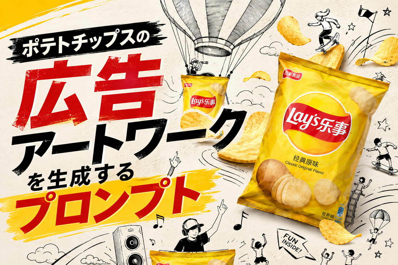
今回ご紹介するのは、ポテトチップスのパッケージを主役にしながら、手描き風のドゥードルイラストを組み合わせた、遊び心のある広告アートワークを生成するプロンプトです。
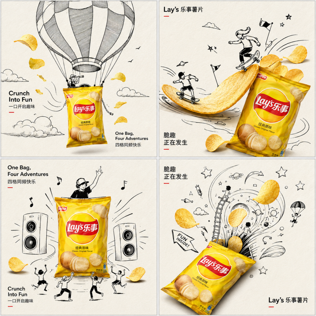
ひとつの画面を2×2の4分割レイアウトにして、それぞれのパネルで商品とイラストの関係性を変えていく構成になっています。
こうした広告表現の魅力は、商品そのものを説明するだけではなく、「この商品が別のものになったら?」という発想で見る人の想像力を刺激できるところです。
今回のプロンプトでも、ポテトチップスの袋を気球のバスケットやスケートボード、スピーカー、さらには別世界への入口のように見立てています。
つまり、単純な商品写真ではなく、「商品そのものをアイデアの中心に置いたビジュアル広告」として仕上げる設計になっているわけです。
4つの場面で見せるのがポイントだもね!
今回使うのはChatGPT
今回の画像生成に使うのは ChatGPT Images 2.0 です。
OpenAIが2026年4月に発表した画像生成モデルで、複雑なビジュアル制作や細かな指示への対応、画像内のテキスト、レイアウトなどを重視した画像生成に対応しています。
特に今回のような複数の要素をひとつの画面に整理して配置するデザインとは相性のよい機能です。
OpenAIの公式情報でも、ChatGPT Images 2.0は、詳細な指示に従いながらオブジェクト同士の関係を正確に配置したり、複雑なレイアウトやテキストを含む画像を生成したりする能力が紹介されています。
また、ChatGPT Images 2.0では、新しい画像の生成だけでなく、既存画像をアップロードして変更を指示することもできます。
そのため、最初から完璧な広告を一発で狙うだけでなく、生成した画像を見ながら「ここをもう少しシンプルに」「商品の位置を調整して」といった形で仕上げていく使い方もできます。
なお、ChatGPT Images 2.0は現在すべてのChatGPTプランで利用できます。画像生成に思考機能を使う場合は、対象となる有料プランなど条件が異なります。
ここからは、今回のプロンプトを実際に使うときに、どんなところに注目すると面白いのかを見ていきましょう。
細かな構成まで指示できるのが心強いなも!
プロンプトの紹介
Create a premium 2×2 grid advertising artwork for Lay’s potato chips, one single image divided into four equal panels, all in the same clean conceptual style. The overall poster should feel witty, fresh, playful, highly designed, and visually interactive, with strong art-direction and collectible ad-poster quality.
Core visual language:
minimal warm off-white paper-texture background, lots of clean negative space, refined black-and-white hand-drawn doodle illustration, combined with realistic colorful Lay’s potato chip packaging and golden chips as the only strong color highlights. The mood is smart, humorous, light, graphic, and premium.
Layout:
a clean 2×2 composition, four square panels, evenly aligned, thin subtle spacing between panels, unified visual rhythm, same art style across all four scenes, like a campaign series presented in one page. Keep the image neat, balanced, and high-end.
Product:
Use iconic realistic Lay’s potato chips bag packaging as the hero object in every panel. The bag should look authentic, glossy, premium, instantly recognizable, with strong realistic volume, shadows, highlights, and crisp brand identity. Prefer classic bright yellow Lay’s pack as the main hero, or use a harmonious family of Lay’s colors if needed, but keep the campaign unified and clean.
Each of the four panels should show a different playful interaction between the real Lay’s bag / chips and the black doodle world:
Panel 1:
The Lay’s chip bag acts as a hot air balloon basket, floating upward. Hand-drawn doodle balloon canopy above, clouds, tiny birds, airflow lines, cheerful adventure icons. Golden potato chips fly around like wind-blown leaves.
Panel 2:
The Lay’s bag becomes a skateboard or surf ramp. Black line doodle characters slide across curved chips as if they are skate ramps or waves. Motion lines, stars, mini flags, playful action symbols. Strong sense of movement and energy.
Panel 3:
The Lay’s bag works as a music speaker or party amplifier. Doodle sound waves, dancing lines, tiny music notes, happy mini figures, chips bouncing outward like rhythm beats. The composition feels lively and punchy but still visually clean.
Panel 4:
The Lay’s bag becomes a doorway or portal into a doodle snack universe. Hand-drawn swirls, stars, floating chips, tiny ladders, adventurous mini people, playful arrows, and whimsical snack symbols emerging from the bag opening. The scene should feel imaginative and delightful.
Art direction:
The hand-drawn doodles must be elegant, controlled, witty, and compositionally smart, not childish scribbles. Use clean black ink lines, refined cartoon minimalism, soft humor, and subtle visual storytelling. The real product should interact directly with the doodles so the scene feels cleverly integrated, not pasted on top. Every panel should have one clear visual joke or interaction.
Chips:
Golden Lay’s potato chips should appear in all four panels as supporting heroes, realistic, crisp, lightly salted, appetizing, floating or interacting with the doodle world. Some chips can act like suns, wheels, stepping stones, surfboards, or flying objects, but all ideas must remain clean and readable.
Typography:
Add minimal but artistic campaign typography, clean and modern, integrated into the overall layout, not large messy headlines. Use a stylish mix of English and Chinese, with refined spacing and ad-design elegance. Suggested text:
“Lay’s”
“Crunch Into Fun”
“One Bag, Four Adventures”
Chinese text:
“乐事薯片”
“一口开启趣味”
“四格同频快乐”
“脆趣正在发生”
Typography should feel editorial, light, premium, and balanced with the visuals. Avoid crude heavy fonts.
Overall feel:
clean commercial illustration poster, conceptual packaging ad, modern minimal layout, clever visual interaction, witty and bright, premium campaign board, playful but sophisticated, high-end brand presentation, warm paper background, realistic product photography mixed with black ink doodle art, strong negative space, strong composition, 8k, hyper-detailed, unique, memorable.
Negative prompt:
messy layout, cluttered background, low detail, childish doodles, cheap design, distorted packaging, blurry logo, too many objects, overdecorated poster, dark background, random colors, weak interaction, flat composition, generic snack ad, unreadable text, extra products, low-end illustration
今回のプロンプトで特徴的なのが、ポテトチップスの袋を4つの異なる役割に変身させているところです。
1枚の画像を2×2のグリッドに分け、それぞれのパネルに違ったシチュエーションを設定しています。
- 気球のバスケットとして空へ浮かぶ
- スケートボードやサーフランプのように使う
- 音楽を響かせるスピーカーになる
- お菓子の世界へつながるポータルになる
このように、同じ商品を繰り返し登場させながら、周囲のドゥードルだけを変えていくことで、ひとつの広告キャンペーンとして統一感のある4コマを作る設計になっています。
単純に4枚のイラストを並べるのではなく、商品とイラストが直接関係するように指示しているのもポイントです。
袋そのものが遊び道具になるだも!
広告らしさを作る細かな指定
プロンプトを読んでみると、単に「ポテトチップスの広告を作って」とお願いしているわけではありません。
背景、レイアウト、商品の見え方、イラストの線、チップの質感、文字の扱いまで、それぞれ細かく条件を設定しています。
たとえば商品については、袋をリアルで光沢のあるパッケージとして描き、立体感や影、ハイライトまで指定しています。一方でドゥードルは黒い線画に統一し、商品のカラーとのコントラストを作っています。
さらに、広告内の文字についても英語と中国語を組み合わせ、大きすぎない洗練されたタイポグラフィとして配置するよう指示されています。
こうした細かな条件をまとめて伝えることで、単なる「お菓子のイラスト」ではなく、「実際の広告キャンペーンにありそうなビジュアル」を狙えるわけです。
細かな指定が広告感につながるなもね!
プロンプトを使うときのポイント
今回のように長いプロンプトを使う場合は、最初からすべてを細かく変更しようとするより、まずは全体の構成をそのまま試してみるのがおすすめです。
まず2×2のレイアウトや4つのシーンがどのように生成されるのかを確認し、そのあとで背景や文字、商品の見え方などを調整していくと、違いを比較しやすくなります。
また、広告として公開・利用する場合は、実在するブランドのロゴやパッケージを使っている点にも注意が必要です。AIで生成できることと、実際の広告として利用できることは別なので、用途に応じて権利関係やブランドのガイドラインを確認しましょう。
特に今回のような実在ブランドを題材にした画像は、個人で試す用途と商用利用を分けて考えることが大切です。
用途に合わせて確認するだもね…
まずは画像生成を楽しんでみよう
今回のプロンプトは、商品写真とイラストを組み合わせたコンセプチュアルな広告表現を試してみたい方にぴったりです。
特に面白いのは、ひとつのポテトチップスの袋を、気球、ランプ、スピーカー、ポータルというまったく違うものとして見立てているところです。
AI画像生成では、こうした「商品を別のものに見立てる」という発想を具体的なビジュアルに変換できます。
今回のプロンプトをそのまま試したあと、4つのパネルを自分の好きなテーマに置き換えてみるのも面白いでしょう。
たとえば、飲み物なら「海」「宇宙」「音楽」「旅」、スイーツなら「遊園地」「絵本」「スポーツ」「ファッション」のように、商品から連想した世界を4つに広げていくこともできます。
自分だけの4パネル広告を作れるなも!
まとめ
今回ご紹介したプロンプトは、ポテトチップスのパッケージを中心に、手描き風ドゥードルとリアルな商品表現を組み合わせた広告アートワークを生成するためのものです。
2×2の4分割レイアウトを使い、ひとつの商品に4つの異なる遊び方を与えることで、統一感がありながら見ていて楽しいビジュアルを狙っています。
ChatGPT Images 2.0で画像生成を試すときは、まずプロンプトの構成をそのまま使い、そこから自分好みのテーマやシーンへ少しずつアレンジしてみるのがおすすめです。
商品の魅力をただ説明するのではなく、「この商品が別のものになったら?」と考えてみると、広告づくりのアイデアも広がります。
画像生成ならではの自由な発想を使って、ぜひ遊び心のある広告アートワークを作ってみてください。
楽しく試してみるだも!
合わせて読みたい
こちらの記事では、テキストをダークメタル3Dエンブレムに変換できるプロンプトを紹介しています。