ChatGPTでロゴを作ってみたものの、「なんだか既視感がある」、「高級ブランドっぽいだけで個性がない」、そんな経験はありませんか?
ロゴ制作は画像生成AIの中でも意外と難しいジャンルです。シンプルなデザインほどバランスや方向性が重要になり、短い指示では似たような結果になりがちです。
今回紹介するプロンプトは、Xユーザーのみやまさんが公開していたものです。
一般的なロゴ生成プロンプトとの違いは、ロゴの品質基準やデザイン方針をかなり細かく指定していることです。
AIにロゴ制作を依頼すると、どうしてもテンプレート感のあるデザインが出やすくなります。しかしこのプロンプトでは、
- モダンすぎない
- 高級感だけに寄せない
- ヴィンテージを使いすぎない
- モチーフをしっかり見せる
- 18種類の方向性を作る
といった細かな条件が設定されており、比較的バランスの良い提案が出やすくなっています。
ロゴ制作に慣れていない人でも、たくさんの案を見ながら方向性を決めやすいのが魅力です。
比較できるのが強いだもね!
今回使うAIは?
今回使用するのは ChatGPT Images 2.0 です。
最近の画像生成AIはロゴ制作にも対応していますが、特にChatGPT Images 2.0は文字表現やレイアウトが以前より安定してきています。
もちろん完璧ではありません。スペルミスやレイアウト崩れが発生することもあります。
それでも、複数案を一度に比較できる今回のプロンプトとは相性が良く、ブランドの方向性を探る用途にはかなり便利です。
特にオリジナルブランド、創作サークル、ゲーム内企業、架空店舗などのロゴ作りにも活用できます。
創作勢にも便利なもね!
ブランドロゴを作るプロンプト
以下が今回紹介するプロンプトです。使用する際は {{}} の中のブランド名や業種、モチーフなどを書き換えて利用してください。
Create a logo concept sheet for
name=”{{ブランド名。例:Stargazing Tours}}“
industry=”{{業種・ジャンル。空欄の場合はブランド名からAIが判断}}“
mood=”{{雰囲気・世界観。例:mysterious, exciting, nature。空欄の場合は業種とブランド名からAIが判断}}“
motif=”{{主題モチーフ。例:stars, telescope。空欄の場合は業種と世界観からAIが判断}}“
japanese_name=”{{例:日本語名。星空ツアーズ}}” >
Purpose
Generate 18 polished logo concepts for human review.
This is a reusable template prompt.
Adapt the design intelligently to the BRAND_INFO.
Overall Direction
Create a curated logo moodboard with contemporary minimalist taste.
The logos should feel designed, memorable, and brand-ready.
Aim for:
– modern but not sterile
– minimal but not empty
– premium but not overly elegant
– slightly artistic but still usable
– diverse but visually cohesive
– some vintage influence, but not a full vintage badge collection
Important Taste Direction
Do not make the sheet too clean, too delicate, or too corporate.
Avoid the “luxury template logo” look.
The best logos should have clear visual weight, simple charm, and a strong readable symbol.
Visual Style Mix
Use a balanced mix of design approaches:
– bold silhouette icon logos
– clean monoline logos
– simple geometric symbol logos
– negative-space logos
– compact emblem logos
– typography-led logos
– Japanese wordmark logos if japanese_name is provided
– bilingual lockups if japanese_name is provided
– a few vintage-inspired logos
– a few very modern minimal logos
Keep the whole sheet cohesive, but do not repeat the same formula.
Vintage Control
Vintage influence is allowed.
Use vintage-inspired treatment in about 4 to 6 logos only.
The rest should feel more contemporary, simple, and fresh.
Avoid making every logo:
– a circular badge
– an old stamp
– an engraved illustration
– a heritage serif layout
– a scenic emblem
Motif Interpretation
The MAIN_MOTIF should strongly influence the sheet.
Use it in multiple ways:
– direct symbol
– bold silhouette
– simplified line art
– geometric abstraction
– negative space
– small accent detail
– typographic inspiration
Do not draw the same motif 18 times.
Do not make the motif too tiny or decorative.
At least half of the concepts should clearly communicate the motif at a glance.
Logo Composition Rules
Create 18 complete logo lockups in a clean 6 × 3 grid.
Do not include tile numbers.
Do not leave empty tiles.
No captions outside the logos.
Each tile should include:
– a distinctive icon, symbol, emblem, or typographic idea
– the brand name
– optional tiny microtype only if it makes the logo feel more realistic
Most logos should be icon + wordmark.
A few can be typography-led, but avoid lazy plain text-only logos.
Typography Direction
Use typography as a design anchor.
Show both serif and sans-serif possibilities when appropriate.
Use a mix of:
– refined serif
– clean sans-serif
– slightly condensed sans-serif
– spaced uppercase lettering
– Japanese title treatment if japanese_name is provided
Avoid default Helvetica-like text.
Avoid overly elegant fashion-logo typography.
Avoid huge plain wordmarks with tiny decoration.
Avoid script, brush, or calligraphy unless the BRAND_INFO clearly requires it.
Japanese Text Rules
If japanese_name is provided, include 3 to 5 logo concepts using that exact Japanese name.
Treat Japanese text as a real logo title, not just a subtitle.
If japanese_name is blank, do not invent Japanese text.
Density & Weight
Use selective density, but keep each tile visually satisfying.
Each logo should have one strong idea.
Good density:
– bold readable icon
– simple but intentional wordmark
– small accent detail
– enough negative space
Bad density:
– tiny symbol floating in empty space
– thin unfinished line drawing
– decorative dots with no idea
– overly clean luxury spacing
– overfilled vintage illustration
Icon Weight
Icons should feel substantial.
Avoid fragile hairline icons.
Use strong black or deep neutral shapes where useful.
Fine lines are allowed, but they must feel intentional and balanced.
Color Palette
Use a restrained brand palette inferred from BRAND_INFO.
Prefer:
– near black or deep neutral
– warm ivory or soft neutral
– one muted accent color
– one optional stronger accent color when useful
Use 1 to 3 colors per logo.
No gradients.
No metallic effects.
No neon unless the brand clearly requires it.
No drop shadows.
No bevels.
Canvas & Layout
Use a wide presentation sheet.
Arrange logos evenly in a 6 × 3 grid.
Use alternating warm ivory, off-white, and muted beige tile backgrounds.
Keep tile backgrounds flat and clean.
Avoid harsh grid lines.
Keep consistent visual scale.
Icons should be large enough to read.
Wordmarks should be carefully spaced and aligned.
Quality Bar
Every tile must feel like a real logo proposal from a skilled designer.
Minimal does not mean lazy.
Premium does not mean sterile.
Vintage does not mean old-fashioned.
Diversity does not mean random.
The sheet should feel like one brand explored through multiple intelligent directions.
Positive Style Keywords
curated logo concept sheet, contemporary minimalist logo design, strong readable symbols, bold silhouette icon, refined vector mark, tasteful vintage influence, modern brand identity, Japanese-modern restraint, editorial typography, balanced logo moodboard, cohesive diversity, premium but approachable, clean geometry, negative space, simple emblem, designed wordmark
Negative Style Keywords
sterile luxury logo template, overly clean corporate logo, fragile thin line art, tiny floating icon, lazy text-only logo, repeated same layout, full vintage badge collection, old stamp collection, excessive circular emblems, default Helvetica, generic sans-serif logo, fashion brand cliché, random dots, childish icon, clipart, stock vector, clutter, over-detailed illustration, neon, gradient, drop shadow, bevel, metallic, brush stroke, calligraphy unless requested, numbered tiles
このプロンプトの面白いポイント
このプロンプトが優秀なのは、単に「ロゴを作って」では終わっていない点です。
AIが苦手とする部分をあらかじめ細かく補強しています。
- ロゴの種類を分散させる
- モチーフを強調する
- ヴィンテージ率を制御する
- 文字組みを指定する
- 色数を制限する
- テンプレート感を避ける
こうした条件によって、18案が似たデザインになる現象をある程度防いでいます。
また、日本語ブランド名への対応も含まれているため、国内向けブランドの検討にも使いやすい内容です。
まずは試してみよう
それでは、さっそく試してみましょう。
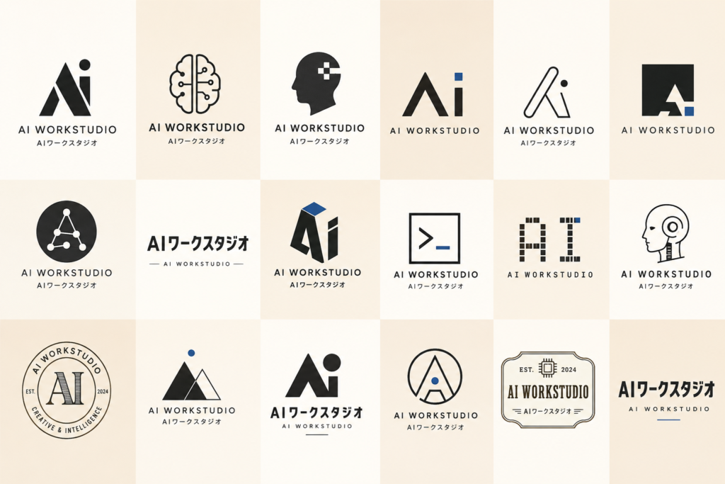
+ボタンで画像の作成に切り替えたら準備完了。
出来上がったものがこちら↓
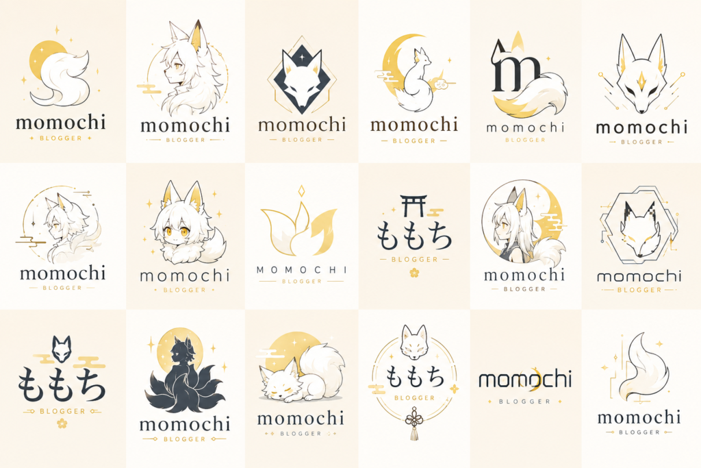
moodは「ファンタジー」 motifは「妖狐」
しっかりバリュエーションが分かれてるだも!
細かく入力しても問題なさそうなも!
まとめ
ChatGPT Images 2.0でロゴを作るとき、短い指示だけでは似たような結果になることがあります。
今回紹介したプロンプトは、ロゴの方向性や品質基準を細かく指定することで、比較的安定して多様なロゴ案を生成しやすくしています。
特にブランド立ち上げ、創作設定、架空企業デザインなどとの相性は抜群です。
ロゴ制作で「なんかイマイチ……」と感じている方は、一度試してみてはいかがでしょうか。
ロゴ迷子なら試す価値あるだも!
こっちの記事ではブランドじゃなくキャラクターのロゴを作れるプロンプトを紹介してるなも!それぞれのプロンプトと役割の違いを比べるとAIへの上手い伝え方がわかるかもなも!